Mindora.
A cognitive training platform that adapts to the person using it
Most cognitive training apps assume steady attention and digital confidence. Mindora is designed for people who have neither on a given day: older adults, people with learning disabilities, and people recovering from brain injuries.
The problem
Brain training apps are built for people who don’t need them most.
[What was going wrong]
Memory, attention and focus affect how independently people can live. They often decline for older adults, people with learning disabilities, and people recovering from brain injuries, and that knocks their confidence in everyday tasks.
Most cognitive training apps assume steady attention and good tech skills. That shuts out the people who need them most: anyone dealing with fatigue, short attention spans or confusing interfaces. What was missing was something that adapts to the person and doesn’t overwhelm them.
Research
Different conditions, surprisingly similar needs.
[What I found]
My primary and secondary research kept pointing to the same needs, whatever the condition. People wanted something that adapts to what they can do, is simple to move around, and tells them clearly how they’re doing.
Long or complicated tasks wore people out, while short activities with a clear goal kept them going. Game elements worked when they felt like challenges, not games, so nobody felt talked down to. Seeing their own progress was what kept people coming back.
[Research synthesis]
Sample size: 5
User goals
from personas + needs- Maintain or improve cognitive abilities
- Build confidence through visible progress
- Do activities that feel achievable and meaningful
Frustrations
from empathy maps- Fatigue from long or complex tasks
- Difficulty understanding instructions
- Stress when progress is unclear
Behaviour patterns
- Prefer short, goal-oriented activities
- Take frequent breaks to avoid overload
- Engage more consistently with guidance and reminders
Accessibility needs
- Simple navigation with limited choices
- Clear visuals and readable text
- Reduced cognitive and sensory load
Motivation triggers
- Immediate feedback and progress tracking
- Non-competitive gamified challenges
- Activities adapted to individual performance
[Constraints]
Attention span, memory, sensory sensitivity and how differently people recover all shaped how Mindora is structured and paced.
- Cognitive load
Dense screens tire people out
Processing visually dense information or many choices increases effort and fatigue.
- Attention span
Long tasks lose people
Prolonged or complex tasks reduce focus and lead to disengagement.
- Sensory sensitivity
Clutter causes discomfort
Visual clutter or excessive stimuli can cause discomfort or anxiety.
- Recovery variability
No single pace fits
Differences in age, learning ability and recovery stage need adaptable pacing and interaction patterns.
Design
Two versions, built around two very different users.
[Design approach]
I designed two versions, one for older adults and one for people with learning disabilities, because their needs pulled the design in different directions.
Each dashboard shows only the activities that matter to that person. Challenges keep the tone grown-up. Progress and feedback are there to build confidence, with no leaderboards and no pressure.
The result
Then I put it in front of real people.
[For learning disabilities]
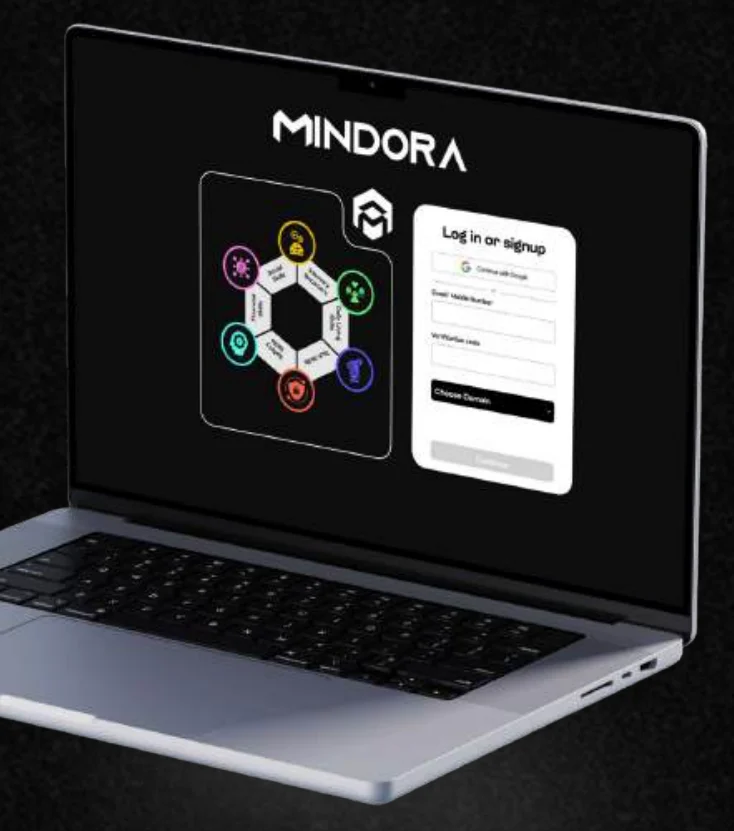
At login, people choose the area they want to work on, so the app is personal from the first screen. The dashboard uses a bento grid with clear sections, which makes it easier to focus on one thing at a time.
[For older adults]
The older-adult version leads with the next real-world task. Tasks are practice runs of things people do every day, like using a TV remote, with one instruction on screen at a time.
[A task, step by step]
The ATM task shows how a task is paced. The PIN stays on screen so nobody has to hold it in memory, each step asks for one action, and the end screen says which skill improved instead of giving a score.
[User testing]
One participant from each domain rated the prototype after testing. Names are withheld.
Participant with a learning disability
Reported strong cognitive support and visual clarity, with minor difficulty in intuitive navigation.
- Cognitive support
- 5/5
- Intuitive
- 3.7/5
- Ease of use
- 4/5
Older adult, 63
Reported strong cognitive support and visual clarity, with difficulty in ease of use and navigation.
- Cognitive support
- 5/5
- Intuitive
- 4/5
- Ease of use
- 3.5/5
Looking back
[What I learned]
- Clear feedback and progress indicators reduced uncertainty.
- Limiting choices and task length helped manage cognitive load.
- Visual cues supported recognition over recall.
- Clean visuals increased comfort and trust.
- Both participants found navigation the weakest point. The next iteration would focus on making it more intuitive.