TWU.
Travel With Us, a personalised travel app that cuts planning overload
Travel planning is spread across too many apps. The problem is not a lack of options, it is too many decisions across too many tools. TWU pulls itineraries, navigation and community insight into one system.
The problem
Planning one trip means juggling five or six apps.
[What was going wrong]
Travel planning is fragmented. People switch between apps for inspiration, booking, navigation, budgeting and local discovery.
That means too many decisions, generic suggestions and a lot of stress, especially for solo travellers and first-time visitors. There’s no shortage of options. There are just too many decisions spread across too many tools.
Inspiration → Booking → Navigation → Local discovery, each in a different app
Research
I surveyed 57 people about how they actually plan trips.
[The survey]
I ran a Google Forms survey with 57 people aged 18 to 34, mostly frequent travellers and families who holiday often. A few things came up again and again:
- Strong interest in AR-based exploration
- High demand for personalised itineraries
- Frustration with finding authentic local places
- Desire for community and collaborative planning
- Pain points around navigation, budgeting and loneliness while travelling
[Survey findings]
- 1/3+of respondents (19+) travel multiple times a year
- 83%were interested in a personalised digital magazine of local and underrated spots
- Majoritywere keen on 3D and AR features in a travel app
[Problems travellers named]
Inaccurate accommodation
Stays that do not match their listings.
Finding local places
Hard to find authentic cafes and spots.
Language barriers
Getting around without the local language.
Restroom accessibility
Basic needs that are hard to plan for.
Loneliness
Especially for solo travellers.
Money & emergencies
Trip budgeting and medical emergencies.
[Existing tools]
Most respondents used MakeMyTrip, followed by Airbnb, Goibibo and Trivago. Each covers one slice of the trip, which is exactly the fragmentation people described.
Design
Less planning, more travelling.
[Design focus]
So TWU tries to take planning work off people’s hands by:
- Turning preferences into ready itineraries
- Supporting decisions before, during and after the trip
- Integrating inspiration, booking, navigation and reflection
- Offering AR views of stays, so people know what they are booking
[Wireframes]
I wireframed the whole booking journey in greyscale first, from onboarding to payment, to get the order of decisions right before thinking about visuals. The AR option already sits on the hotel page here.
The result
One app from booking to the last day of the trip.
[Personalised itinerary]
After booking, people get a day-by-day itinerary laid out like a magazine, based on how long they’re staying, what they like and where they are. It works as a light guide for a place they don’t know.
- Payment confirmation leads straight into the itinerary.
- The magazine format answers the 83% who wanted personalised local highlights.
[AR view of stays]
Inaccurate listings were a top complaint. A "view in AR" option on each stay lets people look around the actual place before they book.
- The AR entry point sits on the listing photo, where doubt about a stay starts.
[Onboarding]
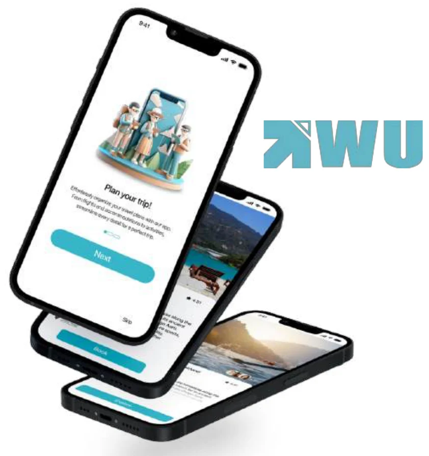
The final onboarding keeps the wireframe structure: three short intro screens, then interests. Choosing interests up front is what lets the app suggest a personalised itinerary later.
[Planning a trip]
Search starts from where you are going, with popular destinations and average spend. After booking, the trip opens as a day-by-day magazine.
[Stays and trips]
Looking back
[What I learned]
- Planning gets exhausting when everything lives in a different app. Putting the decisions in the right order helped more than adding features.
- I learned to turn survey findings into actual flows, and to keep big ideas like AR and personalisation realistic enough to use.