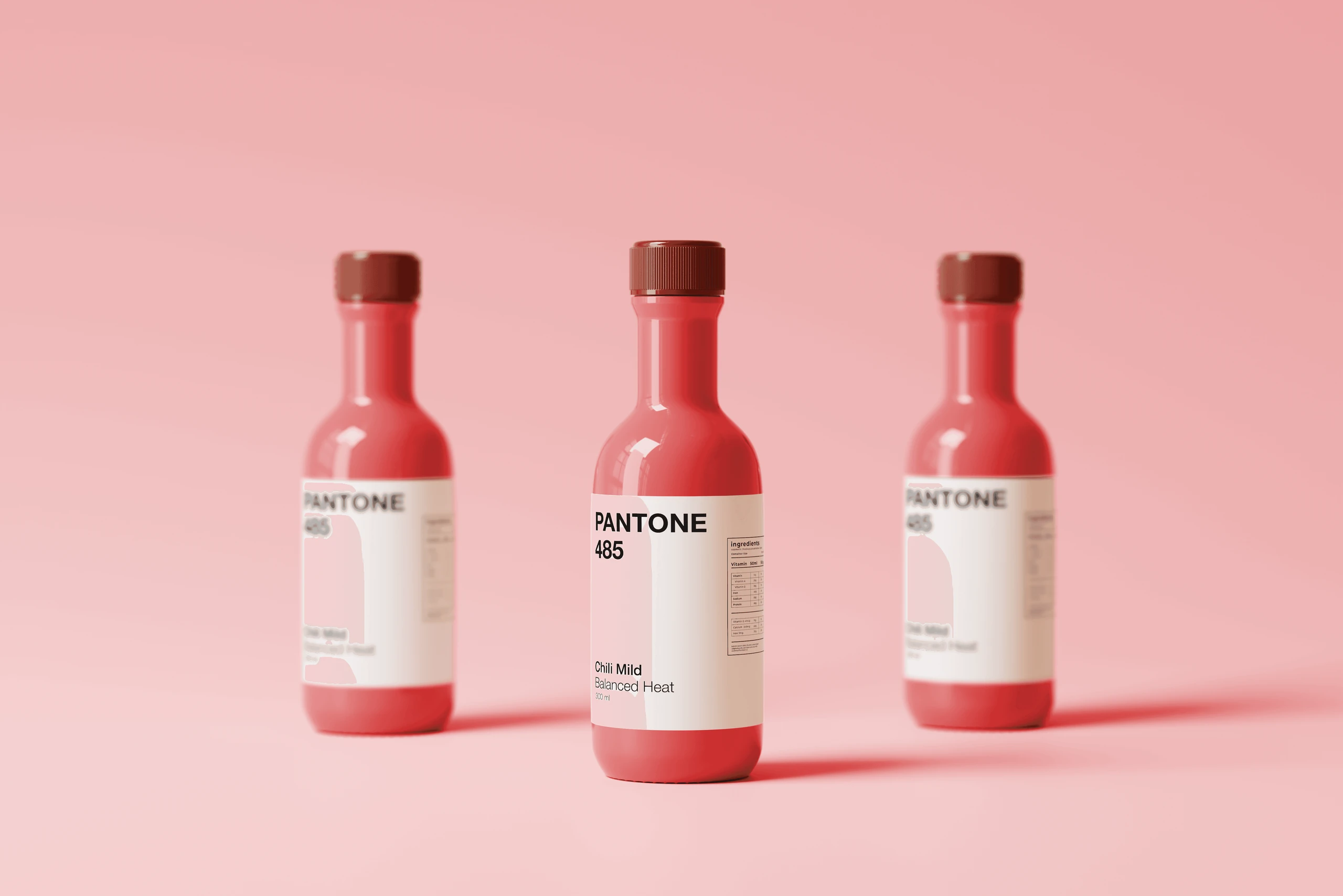
Pantone Sauces.
A condiment range where flavour is colour
Sauce labels are a mess of tomato photos, flames and rustic fonts. This concept sells every sauce like a Pantone swatch: one solid colour and a plain white label, so you can spot your flavour from across the shelf.
- Conceptual branding
- Packaging
- Systems thinking
[The range]
[Shelf experience]
[The problem]
Why bother? Because the sauce aisle is a mess:
- Tomato photos, flames, garlic illustrations and herbs everywhere.
- Loud gradients, rustic fonts and inconsistent iconography.
- Every brand invents its own flavour language.
- Consumers recognise brands, not flavours. In store, telling variants apart means reading the label instead of seeing the product.
[Research]
I compared how Pantone presents colour with how sauce brands usually present flavour.
- Pantone
Colour is treated as data
No illustration, ornament or metaphor. Authority comes from solid colour fields, numeric codes, minimal white panels, neutral typography and a clear hierarchy.
- The sauce category
Brand first, flavour second
Ingredient illustrations, sensory words like “hot” and “fresh”, decorative fonts, and busy gradients and textures.
[References]
Reference images, not my work.
[The system]
- 01The bottle body is a solid Pantone colour.
- 02The label is a specification field with a strict hierarchy: Pantone code first, flavour name second.
- 03Variant or intensity comes third, and volume sits last as micro-type.
- 04No ingredient photography, no illustrations and no decorative shapes.
[Ideation]
[Type and layout]
Pantone’s typographic hierarchy is kept intact, and everything is left-aligned.
- 1
Pantone code
Helvetica Neue Bold, all caps, the first line on the white label.
- 2
Flavour name
Helvetica Neue Medium, title case.
- 3
Variant / intensity
Helvetica Neue Regular, sentence case.
- 4
Volume
Helvetica Neue Regular or Light at micro-type scale.
[Why it works]
No food photos, no flames, no decoration to decode. You learn the colours once, and after that you can spot your sauce from across the aisle, the same way designers spot a Pantone chip.
A student concept. Pantone is a trademark of its owner and isn’t connected to this project.