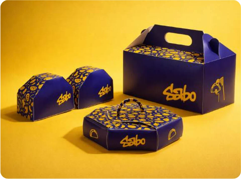
SABO.
Spill-free taco packaging that turns into a tray
Tacos are open-ended, fragile and made to spill. SABO is a modular packaging system where the box protects the food in transit and then becomes part of how you eat it.
- Packaging
- Branding
- User testing
[The problem]
Tacos are open at the top, fragile and made to spill. The usual paper wrap doesn’t help much when you’re eating on the go, and more and more tacos are being delivered or eaten standing up.
[What I noticed]
- People struggle to eat tacos neatly, especially standing up or on the move.
- Vendors said wraps are cheap but slow them down when orders pile up.
- Other brands like Taco Bell use basic wraps; small taco trucks prefer open trays.
- People cared more about clean and convenient than about traditional-looking wrapping.
[The brief I set]
- No spills and no collapsing
- Quick for vendors to fold and store
- One system from 1 taco to a big order
- Lid, base and tray in one simple form
- Nice to open and easy to eat from
[Paper prototypes]
I folded a lot of paper. Each version was tested for strength, how easy it was to carry, and whether it could turn into a tray.
[The final system]
[Testing]
I tested the final prototypes with 3 people:
- Little to no spillage, easy to open and close, and it travelled well.
- The tray made eating easier, and people liked the bigger pack for sharing.
- Their suggestion: room for sauce sachets.
[Name & logo]
- Name
From “sabor”, flavour
Short, easy to remember, and not tied to tacos if the brand ever grows. It has a young, street-food feel.
- Logo
Hand-drawn, with drips
Drawn by hand to feel like street food. Thick strokes so it reads from a distance, and drips for sauce and heat.
[Palette]
- Blue#3F5791
- Yellow#F3C934
- Ivory#FFFCF5
[What I learned]
- Packaging is as much about how people eat as how a box folds. Small changes to a fold made a big difference to the mess.
- The simpler versions kept beating the clever ones.